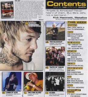
Most contents pages follow the same layout and are very simple in how they are presented. I have taken two from Kerrang which are similar in ways however they have different ways of presenting it. The one to the right side is the layout I would like to go for because it has a variety of picture which has a number that links with the contents of what’s in the magazine. The second Kerrang one, below has the main picture right at the top, and a fewer ones to side. This focus mainly on the main story and picture it referees imitating how a normal contents would be like. Most of it should be visual and hardly any writing so that the reader gets to be introduced and eased into the magazine rather than attacked.
As it follows the same headings and graphology, it changes as they are no long down the side in a list, but at the bottom all squashed at in four columns.
The contents page ideas that I would include will have a Varity of subheadings that will include the story underneath.
News:
04 Bullet for my valentine
05 Return of 30 seconds to mars
06 Matt Tucks injuries
08Rock legends Papa Roach
Live Reviews:
09 Parkway Drive at the roundhouse
10 Enter Shikari + Cancer Bats
11Taking Hayley
Features:
012 The Ocean’s Eyes (hot new band)
015 Green Day- uno dos tres
Posters:
16 YouMeAtSix, Dave Ghrol, Nirvana, Lostpropehts, Sleeping with sirens, La Dispute
Albums:
23 Blitz Kids
24 Rage Against The Machine
25 Fall Out Boy
Gig guide:
26 Special (Madina Lake and Miss may I)
29Win tickets for Download

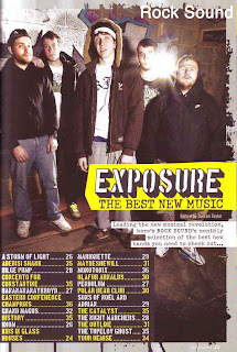
 Now looking at rock sound and how they present their consents pages is very different. They only use on large image that takes up the whole page as a wallpaper. This is very UNIQUE because this magazine is not as well known. They have nor properly followed the codes and conventions of an average magazine as they are trying to break from the original layout and tried to be different. I don’t think that I would use this style because it is so strange and well known, and if I were to start a magazine I would want to follow the stereotypical conventions so my audience do not get too confused on my magazine, even though it would lack originality. However I did pick this out because I thought that rock sound was a good magazine to analyse. It is different from kerrang as it comes out once a month, this may be why it differs and also the layout is definitely more professional and classy. It is not so in your face and packed with lots of pictures that make the reader excited as much as their audience seem to be older. I think I will bled the two ideas together to create something similar but more leanest on the kerrang style.

No comments:
Post a Comment